Black Friday Special Sale - Limited Time 70% Discount Offer - Ends in 0d 00h 00m 00s - Coupon code: mxmas70

Home > Qlik > Qlik Sense Business Analyst Certification > QSBA2024

QSBA2024 Qlik Sense Business Analyst Certification Exam-2024 Question and Answers

Question # 4

The human resources department needs to see a distribution of salaries broken down by department with standard deviation indicators.

Which visualization should the developer use?

A.

Distribution plot

B.

Box plot

C.

Histogram

D.

Scatter plot

Full Access
Question # 5

A business analyst is creating an app using a dataset from ServiceNow. The dataset shows information about support cases, including how many days it has been since the case was opened (age).

The app requirements are:

• The dashboard must display support cases in categories based on the age (New, Aging, and Beyond Service Level Agreement)

• The categories will be used multiple times in the dashboard

• Given the volume of support cases, it is expected that the dataset will grow to be very large

Which solution is the most efficient way for the business analyst to create this app?

A.

Ask the ServiceNow team to create the field in the source dataset

B.

Create an Excel sheet with all possible age values and the corresponding categories to add to the data model

C.

Create a new field for the categories using the Bucket option in the Data manager

D.

Write a master dimension with a nested IF statement to group ages together

Full Access
Question # 6

A business analyst is building an app to analyze virus outbreaks. They create a bar chart using a dimension of Continent, and a measure of Sum (Knowningsections). They require a secondary bar on the chart, so they create a second measure using Count (MajorCities).

The bar chart adjusts, but no bars are visible for this second measure. Which action should the business analyst take to resolve this issue?

A.

Enable Value labels within the Presentation section of the Appearance properties

B.

Recreate the second measure as an alternative measure

C.

Change the Y-axis Range scale from Auto to Custom and select a suitable Max value

D.

Convert the bar chart to a combo chart and reconfigure the second measure to be a bar

Full Access
Question # 7

A business analyst needs to build a chart that enables users to analyze the correlation between the following measures for all products:

• Product Sales ($)

• Order Volume

• Margin%

Which visualization should the business analyst use?

A.

Multi KPI

B.

Combo chart

C.

Scatter plot

D.

Pivot table

Full Access
Question # 8

A customer is developing over 100 apps, each with several sheets that contain multiple visualizations and text objects. The customer wants to standardize all colors used every object across every app. The customer also needs to be able to change these colors quickly, as required.

Which steps should the business analyst take to make sure the color palette is easily maintained in every app?

A.

• Design all base objects as master visualizations

• Link each object in each app to the relevant master visualization

• Adjust the data properties as required

B.

• Develop the first app with every variation of object and visualization that will be required

• Duplicate this app to create every other app

• Remove the variations that are not required and adjust the ones needed

C.

• Create all color expressions as variables in a text file

• Load it in each app with an include statement

• Use these variables in the color property of all objects

D.

• Store color definitions within a .qvd file

• Have each app load this file as a data island in the model

•Have every object select its required color property from the rows within the data island

Full Access
Question # 9

A business analyst needs to create a visualization that compares two measures over time using a continuous scale that includes a range. The measures will be Profit and Revenue.

Which visualization should the business analyst use?

A.

Line chart

B.

Bullet chart

C.

Bar chart

D.

Scatter plot

Full Access
Question # 10

The sales manager is investigating the relationship between Sales and Margin to determine if this relationship is linear when choosing the dimension Customer or Product Category.

The sales manager wants to have the potential percentage Sales for each Stage (Initial to Won) of the sales process.

Which visualizations will meet these requirements?

A.

Scatter plot: Measures X-axis Sales and Y-axis Margin, Dimensions Customer or Product category Bar chart: Dimension Stage, Measure Sales

B.

Scatter plot: Measures X-axis Sales and Y-axis Margin, Alternative dimensions Customer or Product category Funnel chart: Segments Stage, Width Sales

C.

Combo chart: Measures Sales and Margin, Dimensions Customer or Product category Pie chart: Dimension Stage, Measure Sales

D.

Distribution plot: Alternative measures Sales and Margin, Alternatives dimensions Customer or Product category Bar chart: Dimension Stage, Measure Sales

Full Access
Question # 11

A customer needs to demonstrate the value of sales for each month of the year with a rolling 3-month summary. Which visualization should the business analyst recommend to meet the customer's needs?

A.

Scatter plot

B.

Mekko chart

C.

Combo chart

D.

Pie chart

Full Access
Question # 12

Refer to the exhibit.

The users of a Qlik Sense app report slow performance. The app contains approximately 10 million rows of data. The business analyst notices the following KPI master measure definition:

Left{ Trim( TransactionName), 1 ) * Right ( TransactionName, 5) Which steps should the business analyst complete to improve app performance?

A.

Ask the developer of the underlying database to change the structure of the field TransactionName.

B.

• In the Data manager, use the Split function to split the field values with the underscore character as the separator.

• In the Data manager, use the Add calculated field function to multiply the 1st and the 3rd column of the split field.

• Reload the data.

C.

Change the master measure definition as follows:

subfield( TransactionName, '',!)* subfieldl TransactionName, ' ', 3)

D.

In the Data manager, use the Replace function to remove the middle part of the field TransactionName

Full Access
Question # 13

A company CFO has requested an app that contains visualizations applicable to analyzing the finance data. Each regional finance team will analyze their data and should only have access to the data in their region. The app must contain a high-level sheet that navigates to relevant detail sheets.

Which features support a logical design structure?

A.

A dashboard of KPIs and section access

B.

A pivot table that filters by region

C.

A Multi KPI with set analysis

D.

A dashboard with regional bookmarks

Full Access
Question # 14

A company CEO requests an app that contains global sales information. The CEO needs to present this information to an audience of international investors during an upcoming meeting.

The presentation must meet several requirements:

• Contain visualizations that present clearly to a large audience

• Answer audience questions dynamically

• Be made available as shared content

• Emphasize important sales revenue

Which Qlik Sense features should the business analyst prepare?

A.

Embed a video player in the shared app with a recording to describe the charts

B.

Create a sheet that features colorful and layered visualizations and export as a PDF

C.

Set up NPrinting to connect to the app and design a si ides how-style report

D.

Create a storytelling narration in a published app that contains embedded sheets

Full Access
Question # 15

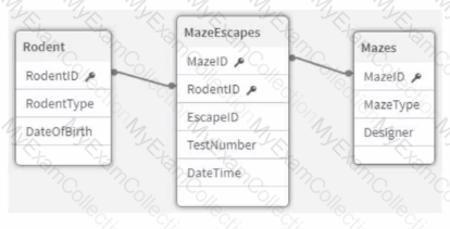
Refer to the exhibit.

An app that will track experiments for rodents (e.g., rats and mice) that navigate mazes (labyrinths) is being developed. Individual rodents are catalogued in the Rodent table, while the Mazes table has metadata for the mazes. The MazeEscapes table holds a record of each attempt at a maze by a rodent. A business analyst needs to build a KPI that will allow users to see how many rodents have made at least one attempt at any maze.

How should the analyst construct the KPI?

A.

• Create RodentlD AS RodentID_Counter in the MazeEscapes table.

• Use Count (Distinct RodentlD Counter) as the KPI expression.

B.

• Create 1 AS RodentID_Counter in the Rodent table.

• Use Sum (RodentlD Counter) as the KPI expression.

C.

Create 1 AS RodentID_Counter in the MazeEscapes table.

Use Sum (RodentlD Counter) as the KPI expression.

D.

• Create RodentlD AS RodentlD Counter in the Rodent table.

• Use Count (Distinct RodentID Counter) as the KPI expression.

Full Access